Palmer Penguins
By Eric Anderson in Theme Features R package
July 2, 2019
“Grid is the very first CSS module created specifically to solve the layout problems we’ve all been hacking our way around for as long as we’ve been making websites.”
— Chris House, A Complete Guide to CSS Grid Layout 1
Since I began building websites in Y2K, I’ve lost count how many times the phrase “…there’s got to be a better way to do this” has passed my lips. Most times, while fighting with floats and widths of content and sidebars or just basically trying to get something beside something else without using a stupid TABLE.
Well, technology sure has come a long way since slicing up images to match the table-based layout that was just created in Dreamweaver. You’d be surprised (or maybe you wouldn’t) how challenging the standard header, content, sidebar, footer layout could be to actually get right.
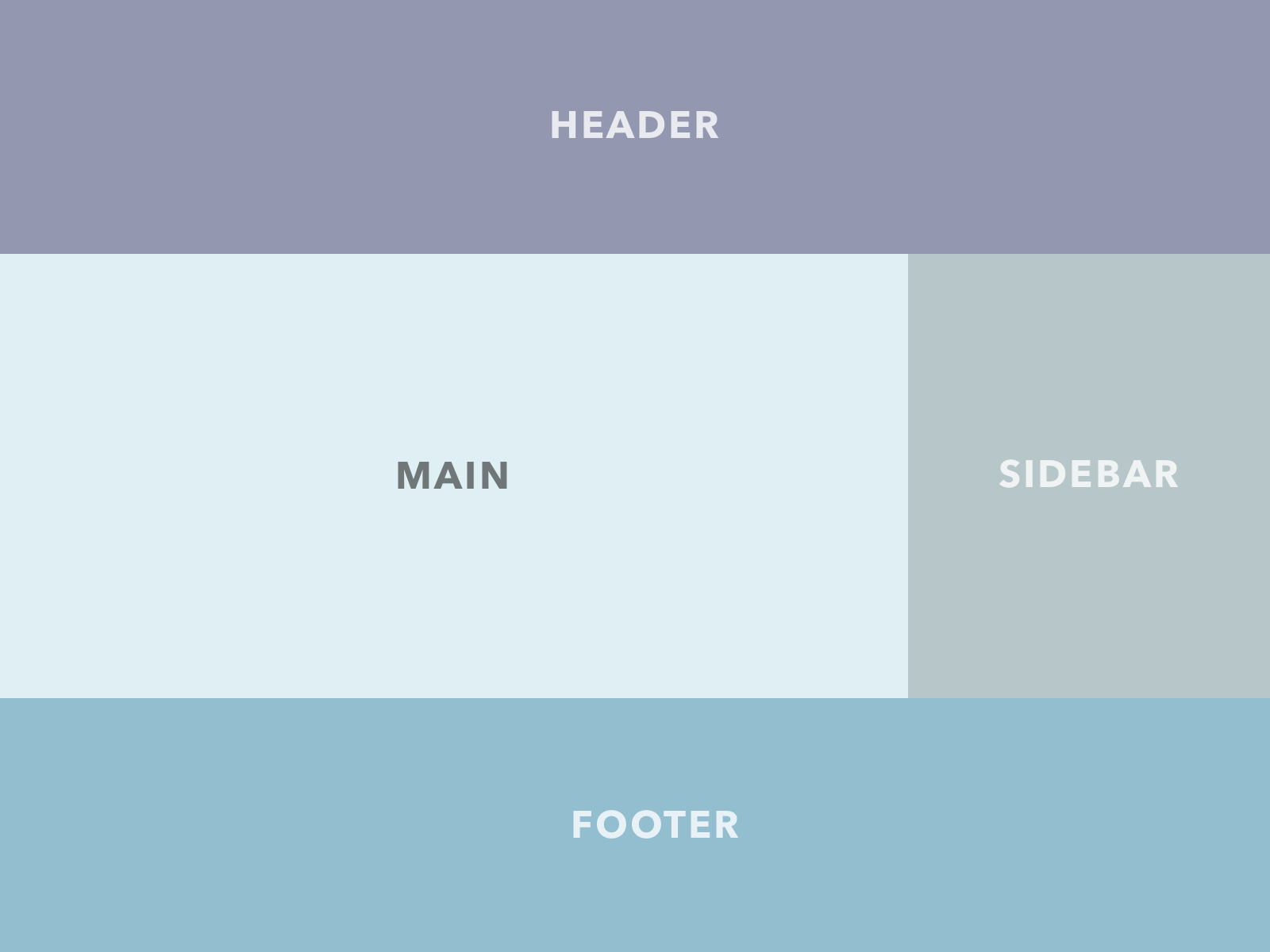
A visual example of the traditional right sidebar layout
ERMAHGERD
A proper grid is what we always wanted, no … needed to build websites with a solid, unbreakable structure. And that’s why I used it in this theme. I call this feature a “scaffold” because none of the content is laid out on this grid. Only the main structure: consisting of the header, footer, main, aside, and footer. As you can tell by this quote from the
W3C on the candidate recommendation itself, Grid is the perfect tool for the job:
CSS Grid Layout Module
This CSS module defines a two-dimensional grid-based layout system, optimized for user interface design. In the grid layout model, the children of a grid container can be positioned into arbitrary slots in a predefined flexible or fixed-size layout grid.
— W3C
CSS Grid is a total game changer, IMHO. Compared to the bottomless pit of despair that is the old way, the new way of building a site structure can be done in as little as 5 lines of CSS. Of course, it always takes more than that, but not much. I mean this is really the meat of the deal:
.grid-container {
  display: grid;
  grid-template-columns: repeat(6, 1fr);
  grid-template-rows: repeat(3, auto);
}
What an amazing time to be a web developer. Anyway, I hope you enjoy this “feature” that you’ll probably never notice or even see. Maybe that’s the best part of a good user interface – the hidden stuff that just works.
-
The original article cited here is now updated and maintained by the staff over at CSS-Tricks. Bookmark their version if you want to dive in and learn about CSS Grid: A Complete Guide to Grid ↩︎